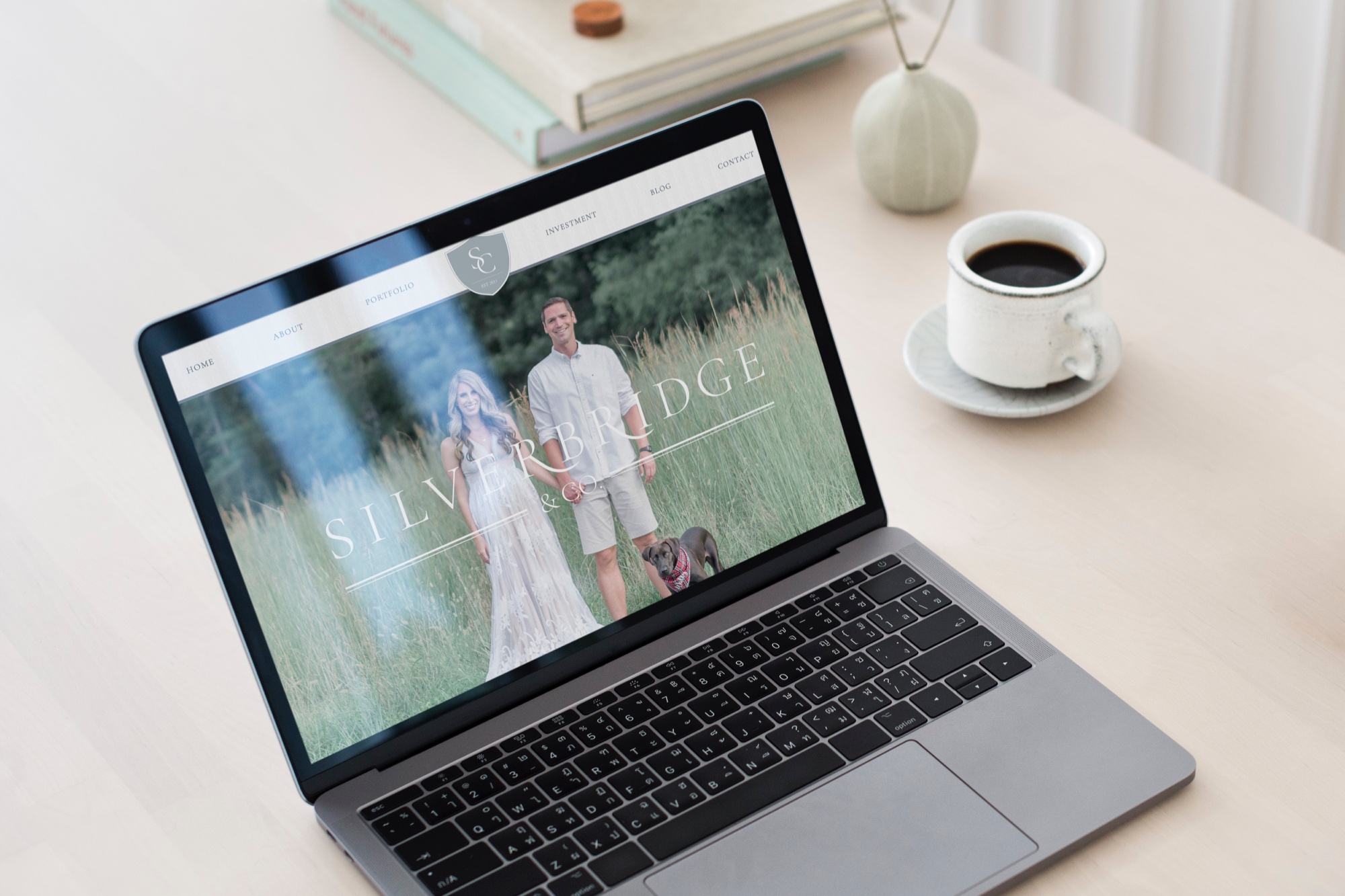
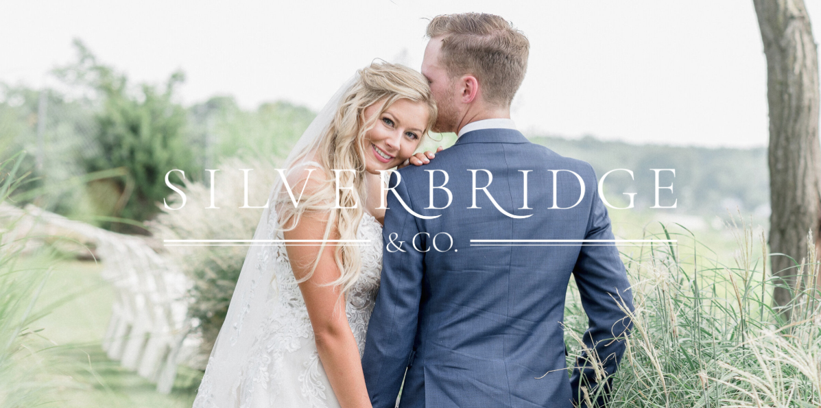
I am so excited to debut the brand and website redesign for Silverbridge & Co. Erica, the founder of S&C is a wedding and portrait photographer across Virginia, D.C, and Maryland. Her attention to detail, and instant best friend attitude, makes her an amazing partner to capture life’s most important moments!
Erica’s original site design featured an outdoorsy logo with visions of the mountains and a cluttered page layout that detracted from her beautiful photographs. In going through the brand process we narrowed in on the focus and aesthetic with new visuals that connected with her ideal clients! S&C is all about trust in the details. This polished yet playful brand is always down for exploring a new city or wandering the cobblestone streets to photograph epic love stories.


Design Inspiration:
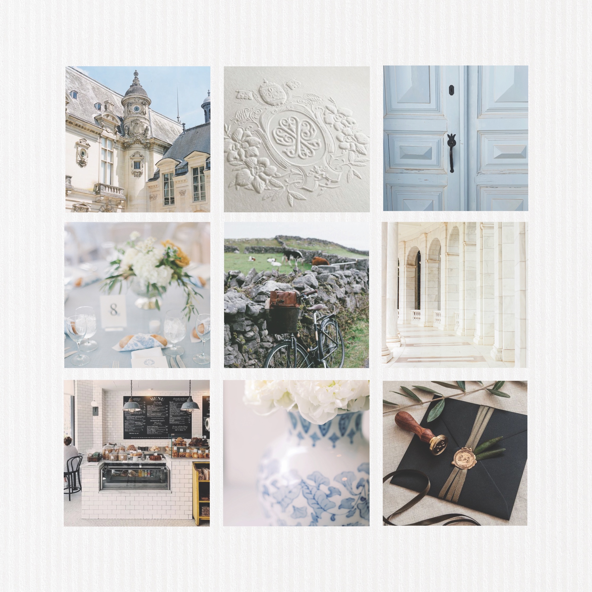
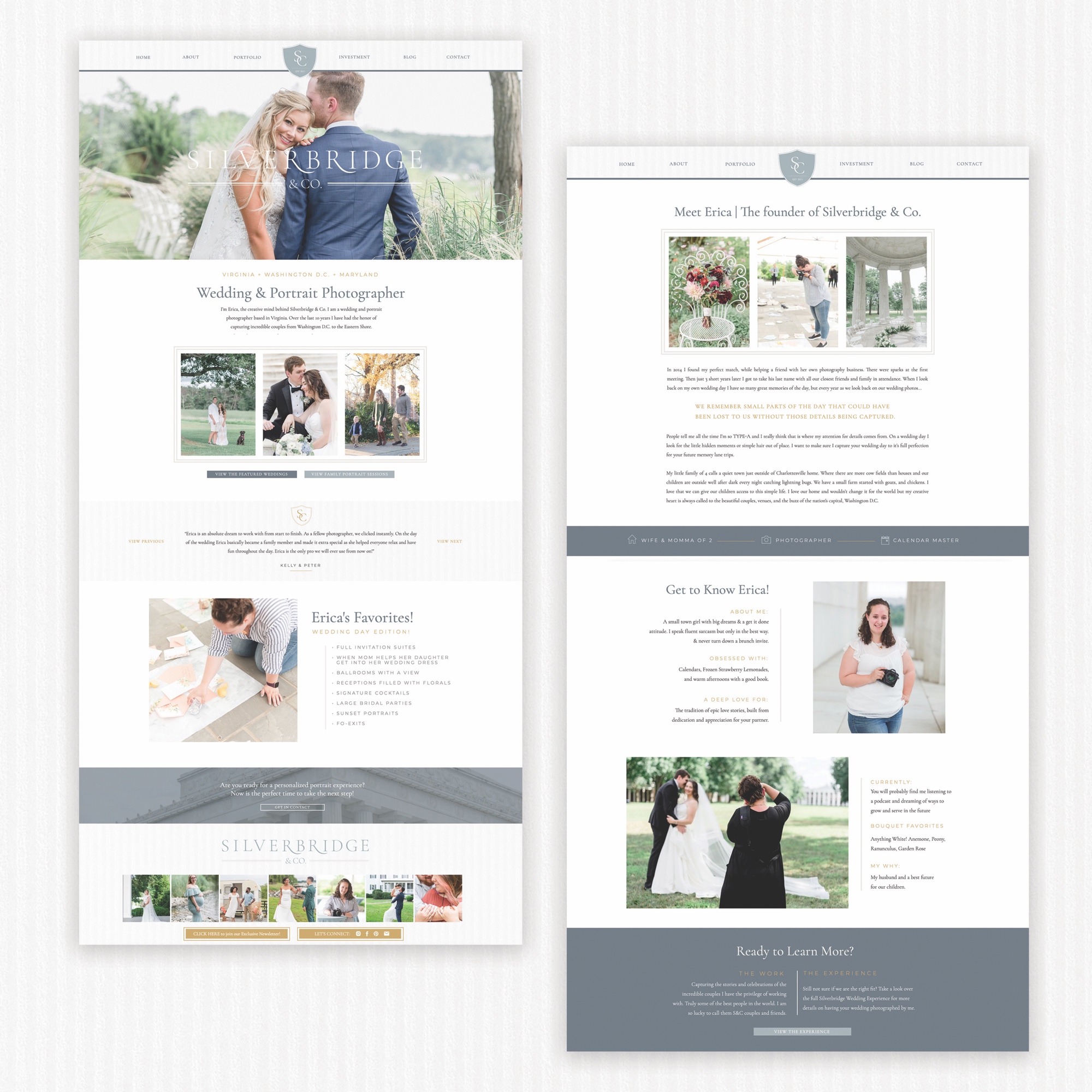
The mood-board design for Silverbridge & Co is one of my all time favorites! We were inspired by the fine art photography of European architecture, with clean lines and detailed flourishes. We pulled in color elements throughout her imagery to land on a mix of slate blue shades, contrasted by the soft sage green and gold accents. Erica is the queen of stripes in her daily life and this is so subtly reflected through the texture paper backdrop throughout her website!
Website Features:
I love the clean and streamline design that allows Erica’s photos to stand out! She has so much to offer in her service packages, we jam packed her portfolio page with multiple galleries to scroll! One of my favorite features comes in the transformation on her Blog page that houses all of her amazing couples stories. We added some extra categories and search features to help streamline her user experience.


Scroll through to check Silverbridge & Co’s Brand and Website redesign! Be sure to view her brand new website HERE!
For more website tips and design strategy, be sure to join my email newsletter HERE!
