There are a few key things that every website needs! If your site is missing one of these pieces, that could be a crushing your conversion and leading clients to book with your competition! As a designer and general internet user I see this ALL THE TIME! In this post, and the video below, I’ll walk you through 3 of the most common elements missing on business website designs. Review these details to make sure your site is in the clear and prepped to book your dream clients!
All of the points below apply to both your website and social media. These are roadblocks I run into all the time when designing my clients websites, as well as just being a general consumer online.
1. Location Details:
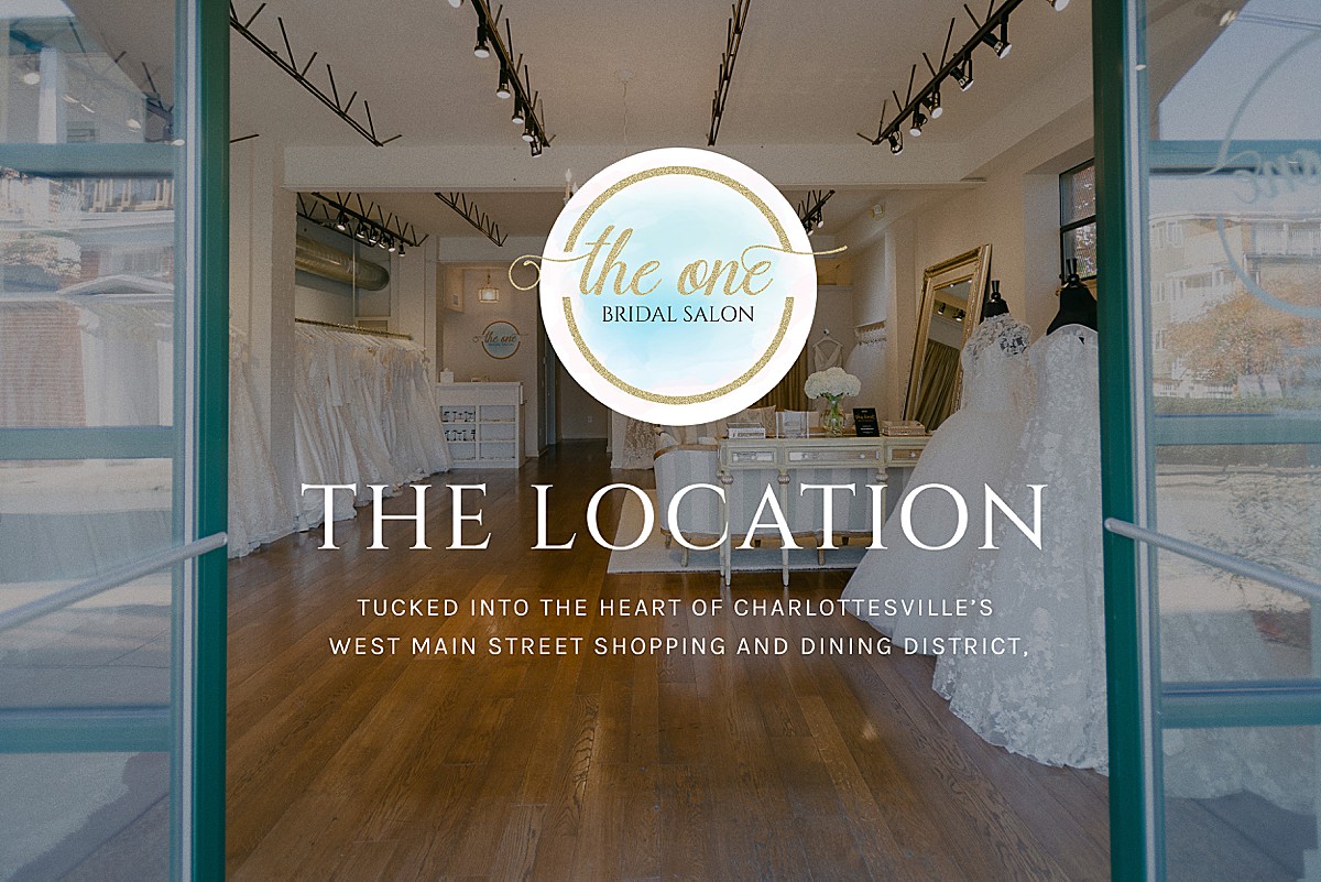
This is an absolute must for service based businesses. Have you ever encountered this? You find a new boutique, service business or coffee shop who totally fits your vibe, and as you start scrolling through their instagram or website you endlessly search to try to determine if they are in your area? In most cases if your business profiles are missing location details, your potential clients are going to click away and purchase with someone else.
This is an easy fix! On social media you should have location details easily visible in the description. I know that bio is precious real estate of 150 characters but you can shorten these details with emojis. On your website this location information should be included above the fold, as well as in the page descriptions and SEO titles, thats a super easy way to make your location visible to clients.

2. Personal brands are KEY:
Your business needs images of YOU. Now I know, for most small biz owners, we love to be behind the scenes and push the focus onto our clients. But, for almost every service based business, having a personal brand is only going to increase your profit and help build referral bookings and a desirable purchase! When you potential client feels like they already know, like, and trust you before ever reaching out to contact you it greatly improves your chances of booking! Be sure that your face shows up in your social media and push yourself to include images of yourself.
Even for those businesses who are selling physical products, having a human element to your imagery showing the product in use and how it is interacted in daily life can make a big impact!

3. Your website needs more than a contact form.
This is probably my biggest website design pet-peeve. If you take anything away from this article, and your friendly website design friends, you need a direct email easily accessible and available on your website! This might not seem like a big deal to most, but you are missing SO MANY potential opportunities for connections and new business by limiting your contact options to a JUST form.
HERE’S 3 REASONS your client’s won’t fill out your contact form.
- There are an overwhelming number of questions, people tend to get distracted or frustrated with extra filler questions that are required. Keep your contact form to around 3-5 questions max!
- You are asking for their phone number… or other “non-essential” personal information.
- They do not fit the form criteria (aka general requests outside of potential clients)
I struggle with this WEEKLY…I’m trying to contact a wedding vendor to share a FREE gallery of images, OR I’m reaching out to a brand for a product question, testimonial or opportunity for collaboration. After a few minutes of searching the usual website spaces (header icons… footer… contact page… social media) I ultimately GIVE UP and move onto the next task.
I get it… you’re looking to avoid one more step in the process if an inquiry messages you directly… and you have to manually sort them into your CRM… Plus there’s the chance for those pesky spam marketers to flood your inbox. BUT the negative effects of NOT having your email available on your website.. are far worse than the occasional extra to-do
Be sure to take a look at your website this week for these potential missing pieces! If you need even more website tips be sure to check out the top 5 yearly updates to make every year!

