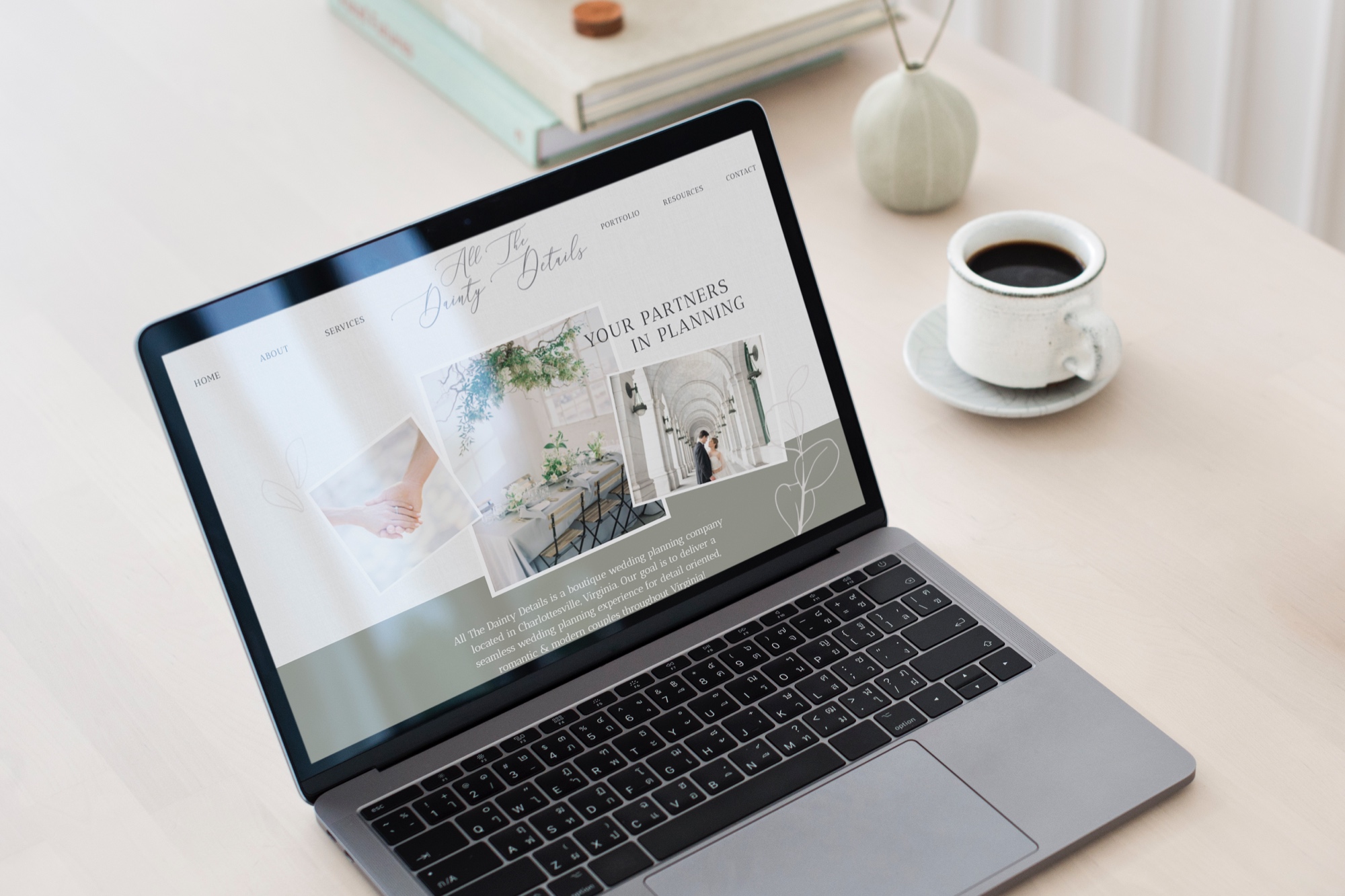
All the Dainty Details website redesign is full of all of my favorite things, beautiful imagery and wedding day details! Mallory and her team of wedding planners, are amazing at creating stress free, beautifully memorable, weddings for their couples. Since relocating to Charlottesville, ATDD needed a facelift to fully show off their new service locations and growing team!
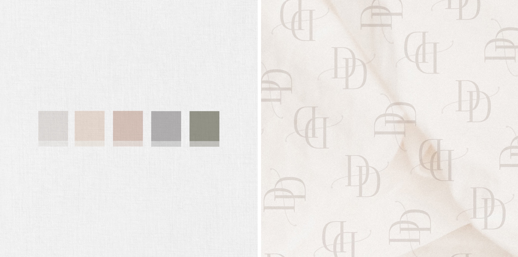
I loved taking Mallory’s already beautiful full name logo and adding in a few extra brand elements to create a suite of submarks, fonts, colors, and styles that matched. We started with establishing the right fonts to help elevate the brand and show off the style of ATDD wedding clients. Then we pulled in the curved tail from the letter forms in her full logo to tie in a bit of movement and dimension with the thin and thick lines. All the Dainty Details new color palette is elegant, romantic, inviting and calm! We were inspired by the overlapping flat-lay imagery, with a mix of florals, papers goods and textures. We used this layered effect as the guiding design throughout their site!


One of my absolute favorite sections is their portfolio page! Instead of breaking up the images into traditional featured weddings, we decided to pull together a collection of seasonal favorites to help inspire any couple looking for the latest trends! Their web pages are lined with soft linen texture, muted color blocks, and vibrant images that show off their amazing couples wedding. All the Dainty Details is jam packed with information. Everything that an inquiring couple could need to get the planning process started! Mallory and her team know that the first few weeks after getting engaged can be overwhelming and they are ready to partner with you to help you narrow down what is most important!
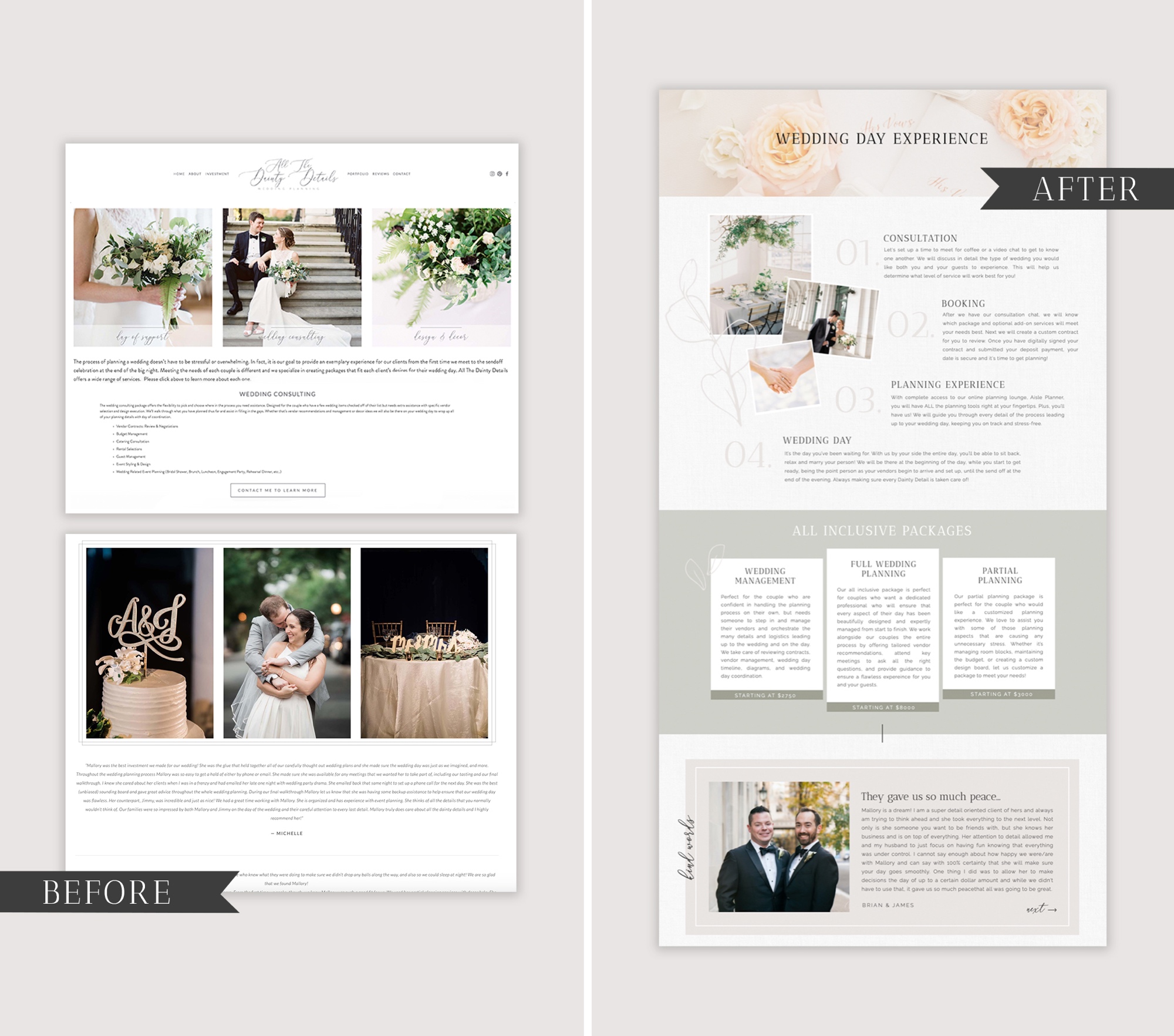
I can’t wait for you to see the before in afters! Mallory and her team already had a ton of useful resources and amazing info to share on her original website, but the presentation was falling short…. With a few simple tweaks and intentional design, her new website pulls together all of the beautiful imagery from her recent weddings and shows off their expertise as Wedding Planners throughout Virginia.
Keep scrolling for an inside look, and be sure to checkout All the Dainty Details full website HERE!


Take a look at the kind words from Mallory about the redesign process!
“I’ve known my website has needed work for quite some time now. Reaching out to Heather was the best investment I could make for my business. She is so professional and organized, which made the process incredibly easy and enjoyable. Heather took the time to really understand me and my vision for All The Dainty Details and elevated my brand in a way nothing else has. This new website kicks my brand into gear. It’s a complete view of me and my style. She did an amazing job perfectly defining the vibe I was looking for. Don’t settle when it comes to your website. It’s the first thing your potential client will see. It needs to make a statement! I can’t wait to see where this new website takes my business this year.” – Mallory Rood (Owner of All the Dainty Details)
Check out another recent favorite website redesign for Little Fox Films HERE!
For more website tips and design strategy, be sure to join my email newsletter HERE!